Flakes - An alternative to proven HTML5 cross-platform UI Frameworks


Every developer can relate to this quote:
There are only two hard things in Computer Science: cache invalidation and naming things.
-- Phil Karlton
I want to add another thing to Phil's list: Finding an UI framework.
Don't get me wrong, there are a plenty of UI Frameworks out there. Bootstrap, Foundation, Skeleton, Semantic UI to name some of them. All of them are amazing, do a very good job and have a loving community behind it. I find myself using something Bootstrap'ish all the time. Preferably I use some theme which is built on top of Bootstrap. I've seen the plain version way too much, so I prefer some different colors while using my experience with Bootstrap itself.
Cross-platform templates
At Thinktecture we love cross-platform development. By that, we mean real cross-platform. Every device from desktop to tablet to phone, every form factor, every operating system. Besides our numerous customer projects, we also write a lot of tech demos. But even the coolest tech demo needs an UI. An UI which loves real cross-platform too, and adapts to every form factor on every device. That's why we end up using Admin LTE a lot which is built on top of Bootstrap 3. It adapts to all form factors we need and has quite a nice look. For example, we built BoardZ - a real cross-platform sample - with it.
Personally I like the style of Admin LTE or other templates. But when it comes to the code behind, almost every template uses jQuery and jQuery-based plugins. This is great for the template author because he can add cool features and target a bigger user base. But when it comes to use the template with Angular, I don't feel the need of using jQuery or it's plugins due to native Angular alternatives. Said that, I normally just grab the CSS of a template, which sometimes does not work as expected since the template uses JavaScript to especially calculate heights of div elements. When using modern CSS with flexbox, such JavaScript is not needed anymore. To get the template working properly, I end up using some of the provided JavaScript, so I can focus on the tech part instead of the UI part.
What would a good template be?
From time to time I'm investing some hours to look for other templates which can be used for our cross-platform tech demos. A lot of the following points also arise from our customer workshops:
- Nice and clean UI.
- Utilizes modern CSS features like flexbox, transitions or animations by maintaining a clean CSS component structure.
- Clean CSS class names. For example I really like the style of Material Design Lite, but I can't get used to their CSS class naming like
mdl-menu__item--full-bleed-divider. - Has a business look: Navigation menu on the left which can be toggled and adapts to different form factors and view port sizes. Content on the right. Maybe a footer or header could be nice, too.
- Absolutely minimal to none JavaScript involved.
- Ideally no mandatory jQuery or plugins.
I'm pretty sure, that without building such a template by myself, it's a hard to find one. Unfortunately I'm not a designer which makes it even harder to create my own good-looking template. :-)
Introducing flakes
Some days ago, Christian sent me a link to flakes which is built by Kumail Hunaid.
Reading through the documentation, I got excited.
Build better business software a lot quicker with flakes.
Built for the real world.
Component Architecture.
The Flakes aesthetic is sharp, uncluttered, task driven and not influenced by todays trends.
That sounds quite good and the UI looks super clean. Digging through the code I found what I expected: jQuery and three plugins: SnapJS, Responsive Elements and Grid Forms. But hey! That's not a Pluginception and still looks like a good starting point. So I only grabbed its main CSS file, copied it to my project and boom! Works like a charm - almost. ;-)
Angularize it
Without flakes' JavaScript, the features mentioned above stopped working, which is totally fine for me, because I don't them need. However, a mandatory feature stopped working, too: If the width of the view port gets smaller, a drawer menu will be shown with the typical hamburger icon to open and close the left-side drawer. Using Angular it is super easy to fix:
<div class="flakes-content" [class.open]="isOpen">
    <div class="flakes-mobile-top-bar">
        <span class="navigation-expand-target box-shadow-menu" (click)="isOpen = !isOpen"></span>
    </div>

    <div class="view-wrap">
        <router-outlet></router-outlet>
    </div>
</div>
Notice the [class.open]="isOpen" which binds the CSS class open to a property isOpen. If isOpen is set to true then the class open will be added to the DOM element. Otherwise it will not be present. This allows us to open and close the left-side drawer menu. For toggling, I just use a simple (click)="isOpen = !isOpen" on a <span> element. Normally, within that span there would be an image for the hamburger menu icon, but that can be accomplished with CSS using the box-shadow-menu class.
Stylesheetize it
Here are the mandatory CSS classes to make the template work again:
open
@media only screen and (max-width: 1149px) {
  .flakes-content {
    transition: transform 0.5s;

    &.open {
      // Default flakes menu width is 250px
      transform: translate3d(250px, 0px, 0px);
    }
  }
}
Nice and clean transition to open and close the drawer. The 250 px is the default width of flakes' drawer menu.
hamburger icon
Some more CSS for a hamburger icon, taken from here:
.box-shadow-menu {
  position: relative;
  padding-left: 1.25em;
  display: block;
  height: 18px;
  cursor: pointer;
}

.box-shadow-menu:before {
  content: "";
  position: absolute;
  left: 0;
  top: 0.25em;
  width: 1em;
  height: 0.15em;
  background: black;
  box-shadow: 0 0.25em 0 0 black, 0 0.5em 0 0 black;
}
Tweak it
Last but not least, we tweak flakes even more. By default, it uses a maximum content size of 900 pixels. Looking at the source code this could be changed via a SASS config variable. 900 pixels is a good width, but on high resolution displays, it looks a bit strange, when the content does not use the provided width and the right side is left blank. Some pieces of CSS can fix this issue and make flakes use the whole width:
@media only screen and (min-width: 1150px) {
  // HTML selector is used to get more specific and overwrite the default rule
  html .flakes-frame .flakes-content {
    width: calc(100vw - 250px);
  }
}
Action!
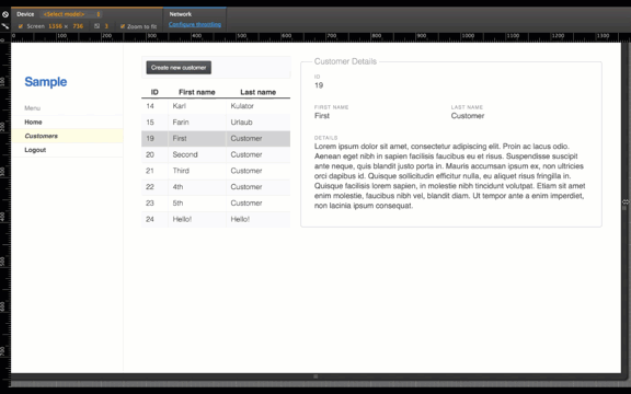
The changes above are enough to get a nice and clean template I can use for demos. If you want to see it in action, take a look at this Angular 2 sample which uses flakes and the changes from above.
If you know CSS frameworks, which meet the requirements from above, please feel free to leave me a comment. :-)